Information Design
As a visual story-teller, I am able to analyze research or complex ideas, synthesize the information, and translate it into visualizations and narratives that help an array of audiences understand the concepts.

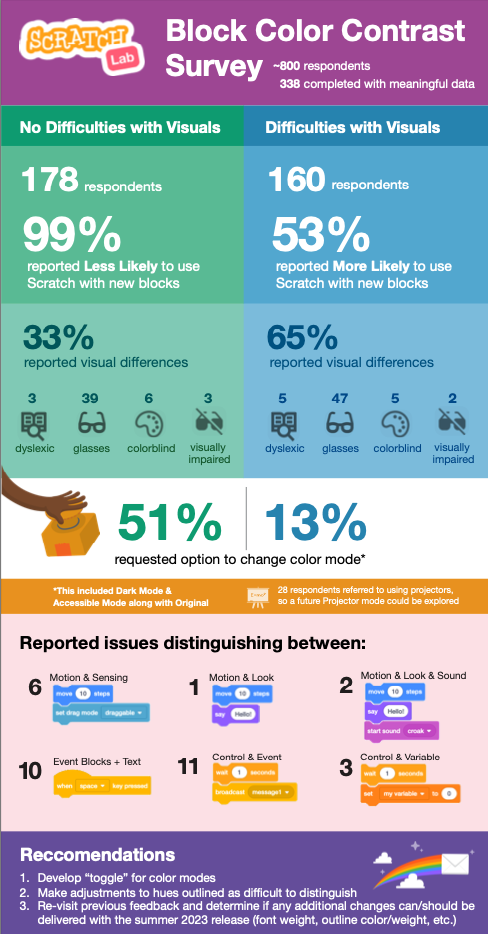
Visual report of survey results from a color contrast study.

Infographic developed to show market segmentation and breakdown of individuals components. (All data masked)

Infographic designed to show affects of fatigue on the human body from jet lag, medical conditions, and shiftwork.
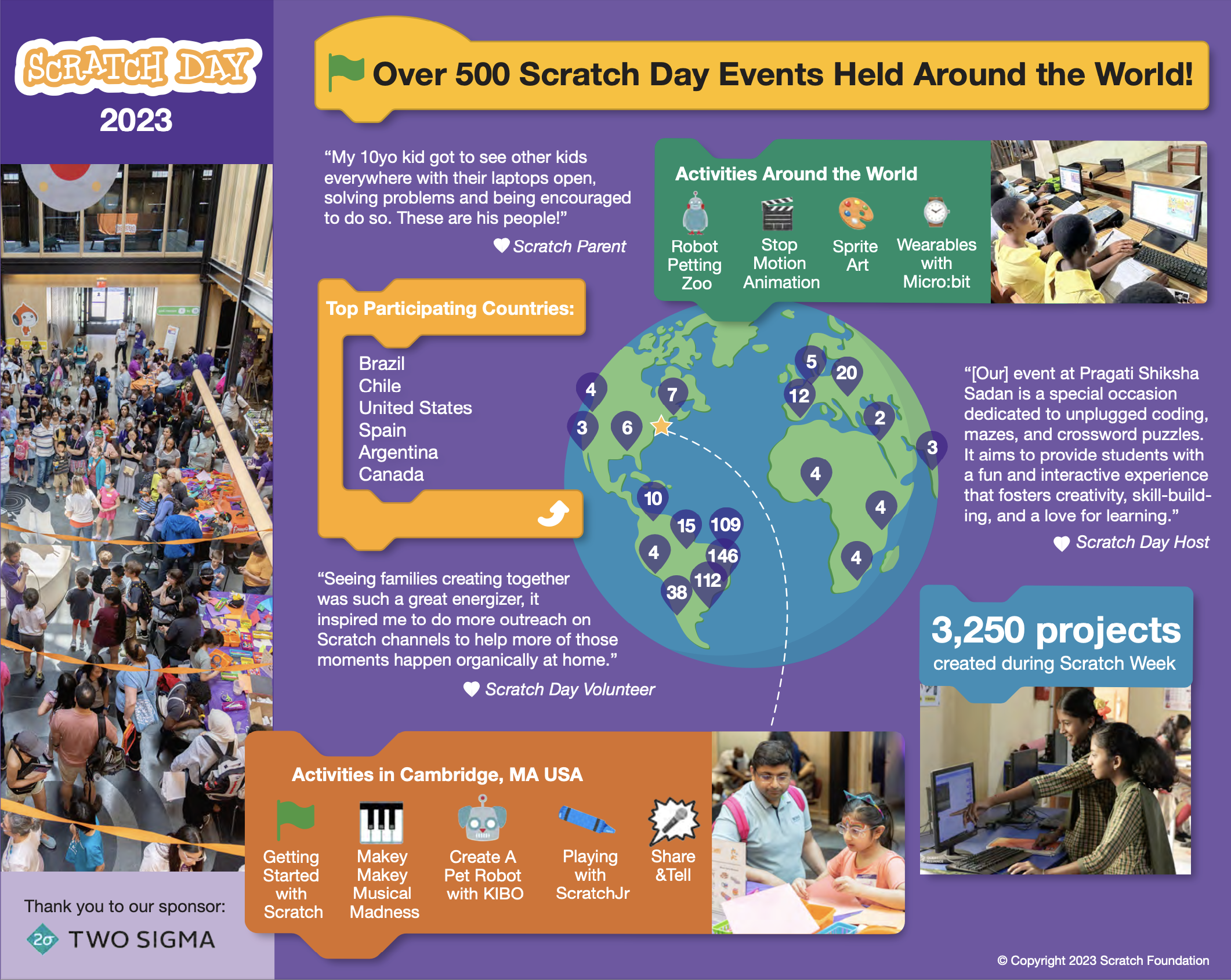
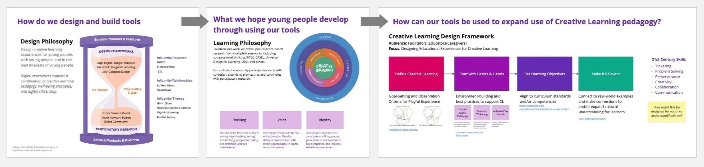
Scratch Day Around the World | 2023 Recap

Simple sleep data paired with results from a PVT (Psychomotor Vigilance Test) displayed on a sleep tracking app.
Design Management Workflows
I’ve found the most effective way to communicate and manage complex processes is to provide visual workflows and frameworks. These documents are used as reference points throughout projects and a true time-saver during the design/development/production work.
Information share-out of how current product aligns to a particular design framework.

Team document showing review hierarchy as well as who is responsible for maintaining which space/schedule/tool etc.

High-Level & In-the-Weeds document to remind stakeholders of where we are at within the design process, so they have a sense of what to focus feedback on.

Deliverable | 30-60-90 Plan & Share-out from Listening Tour
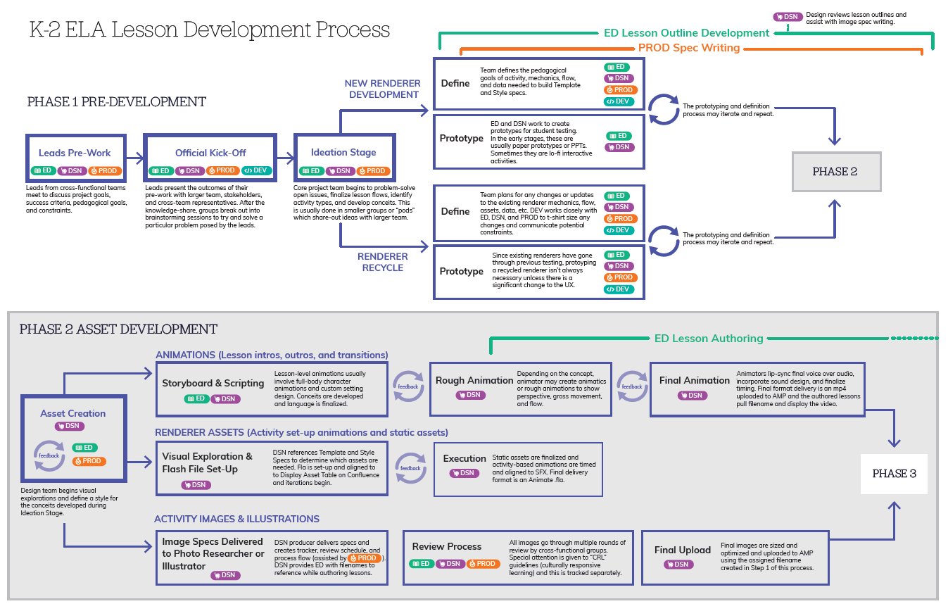
Two-Phase Lesson Development Process to be referenced by all teams working within this flow.
Strategy visualization for structuring cross-team collaboration
Kid-Centric Dashboard Design Exploration
This was an exploration for a student dashboard to display a multitude of data points relevant to the student at different times in the school year. Since the data points would be abstract for the youngest users, I attached the data to the concept of “raising creatures”. As student scores improved, or they completed more lessons, their creatures would grow and give them a mental model of their learning growth in a visual and engaging form. This would also help to motivate students in their lessons.
The screens below play with different features and visual representations of the data across the experience.


Community-Based Information Sharing
I believe design is a form of activism, and I often offer my services to help causes that align with my values. I believe good information design can help educate and motivate people to become involved. I believe in making complex structural systems more transparent to allow for community input and collaboration.

Organization chart for an advocacy group I’ve co-founded to show how our three committees will handle specific areas of focus.
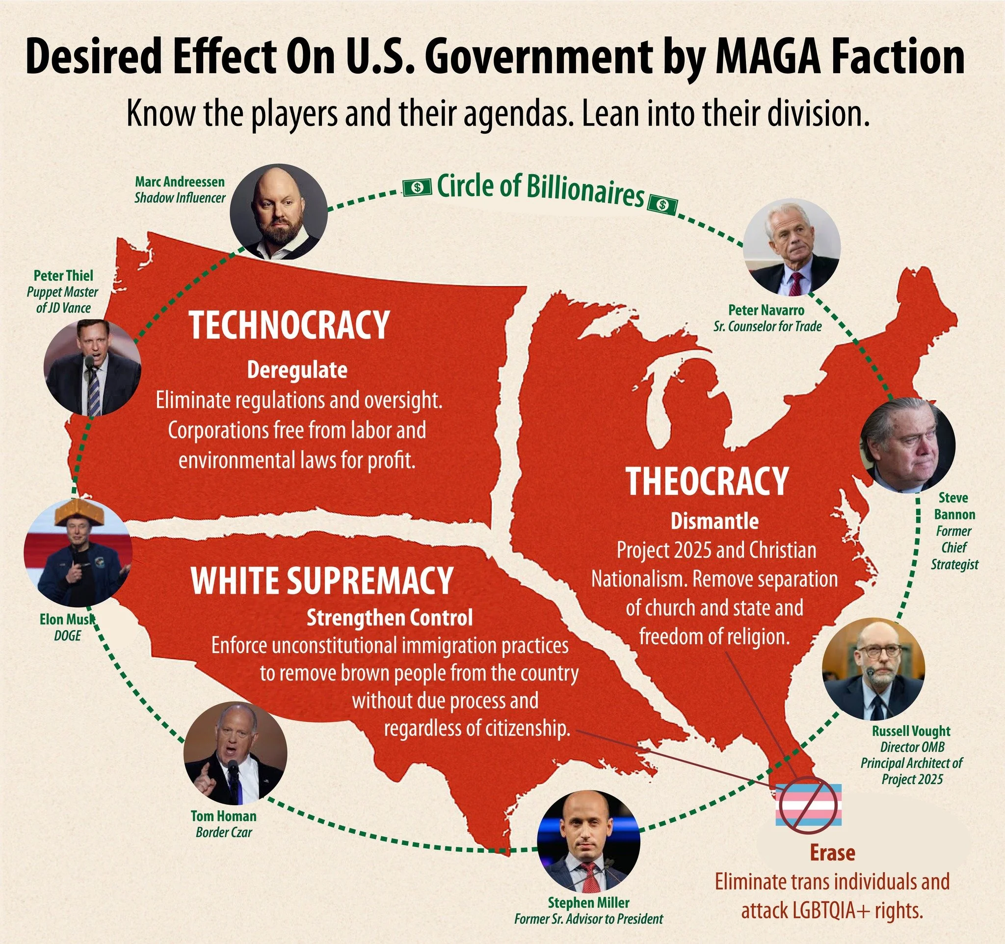
Infographic based on “Letters from an American” by Heather Cox Richardson describing the current non-elected influences over the U.S. government.
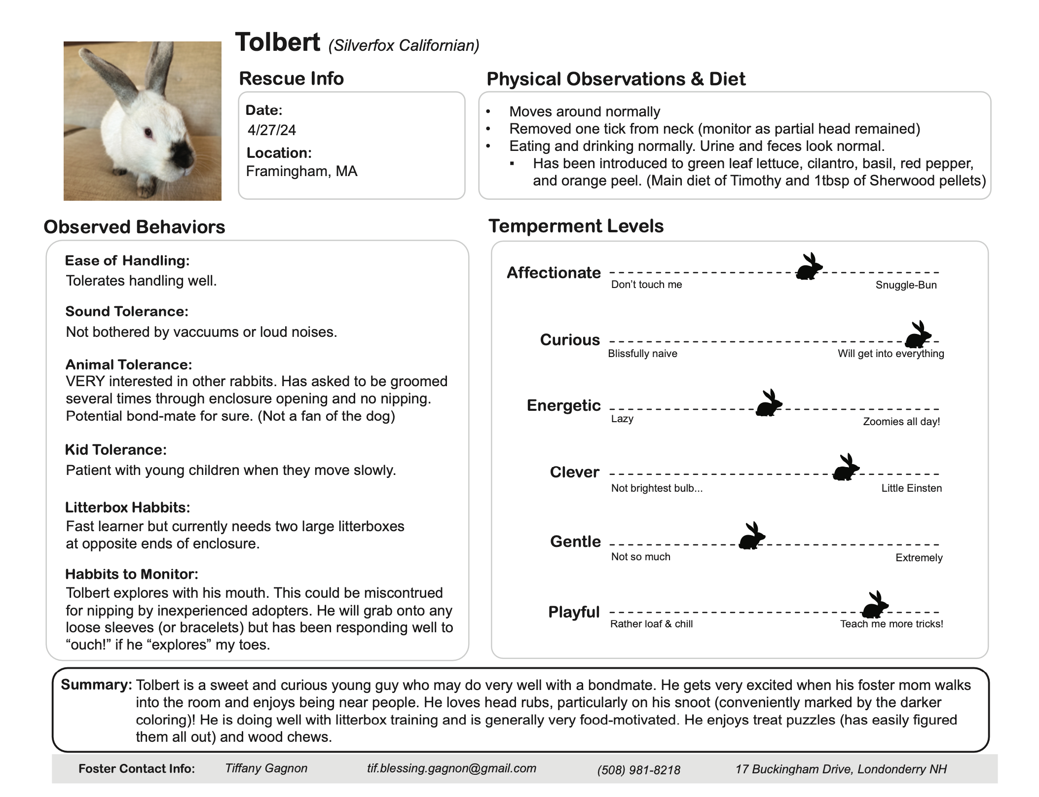
After rescuing several stray rabbits in my community, and becoming a default foster mom while they awaited opening at local rescues and shelters, I created an Information Sheet to give to future adopters.

Infographic outlining Londonderry’s School District (school board, schools, principals, administrative leaders, etc.).
Animated Infographics
I’ve created and directed motion-based infographics with the help of animators. These are two clips from a Safety Video for a large petro-chemical company. Warning: the scripts are cheesy.
2014 “My School Information Design Challenge”
hosted by Foundation for Excellence in Education
The My School Information Design Challenge was launched as a national competition to rethink and redesign the way in which school performance data is presented so that it is more accessible and more actionable for parents, policymakers and the public at large.
I submitted a presentation in 2014 and was noted as a Top Submission after judgement by a panel of various professionals including various superintendents, education advocates, designers, and policy-makers,


